
Ópera do vento
Nino Cais
Ópera do Vento was an exposition by artist Nino Cais at Casa Triângulo gallery. His work was on the immaterial character of the artwork. The initial strangeness gives way to a sensation of rest, as though there were a transcendent or sacred sense. The objects also comment on the body as a matrix of everything that exists in the world, a sort of mold from which everything is born. The exhibition treats on the fluidity between randomness and planning, while valorizing procedural construction.
The school assignment was to design and produce a brochure for an art exhibit. My choice of Nino Cais' Ópera do vento was influenced, mainly, by the minimalist architecture of the gallery. As I went around the show, all I felt was emptiness by the clear open spaces. His work of photography, installations and collages felt also with room to breathe. Except for his mother's letter about him. Reading it I felt exactly as if I was in the middle of a blowing wind. So many words, adjectives and comparisons, it was almost as if I was suffocating.
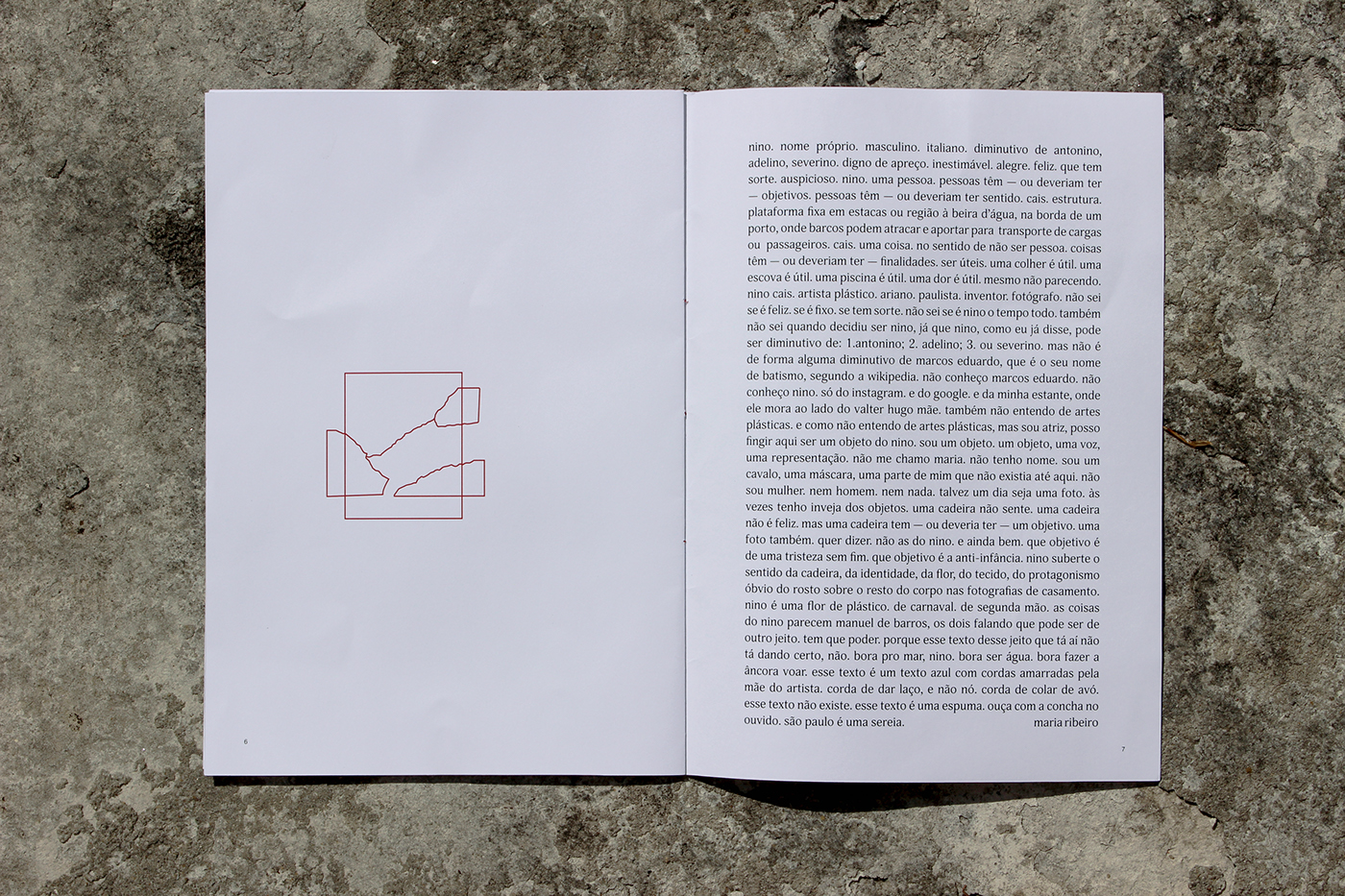
So I chose to design a minimal brochure with open areas and selected phrases from his mother's letter. Not to use photography of his work, I drew them with simple lines to create abstract shapes and leave room for the reader's imagination. They should associate the drawings with the actual work and feel something while reading the text extract.

ouça com a concha no ouvido.

uma dor é útil. mesmo não parecendo
sou um objeto. um objeto, uma voz, uma representação. não tenho nome.
sou um cavalo, uma máscara, uma parte de mim que não existia até aqui. talvez um dia seja uma foto.
Here, the whole letter takes the whole page. The text is written without correct punctuation and it looks like a huge box to cause a massive feeling of heaviness. The other pages were a preparation, with open spaces to breathe, for this one, when you have to take a deep breath and read it all.
The cover and back cover were design with huge random letters. It's supposed to represent this confusion of words and feelings that are about to be discovered in the end of the reading and the exposition. Some hints are highlighted in red, the name of the artist and the title of the exhibit.

This was a school project. All rights are reserved for Nino Cais and Casa Triângulo.


